Enhancing Our Brand Identity
We're kicking off the year by introducing a new brand identity to better reflect our core values to our audience whilst materialising a degree of simplicity and compatibility
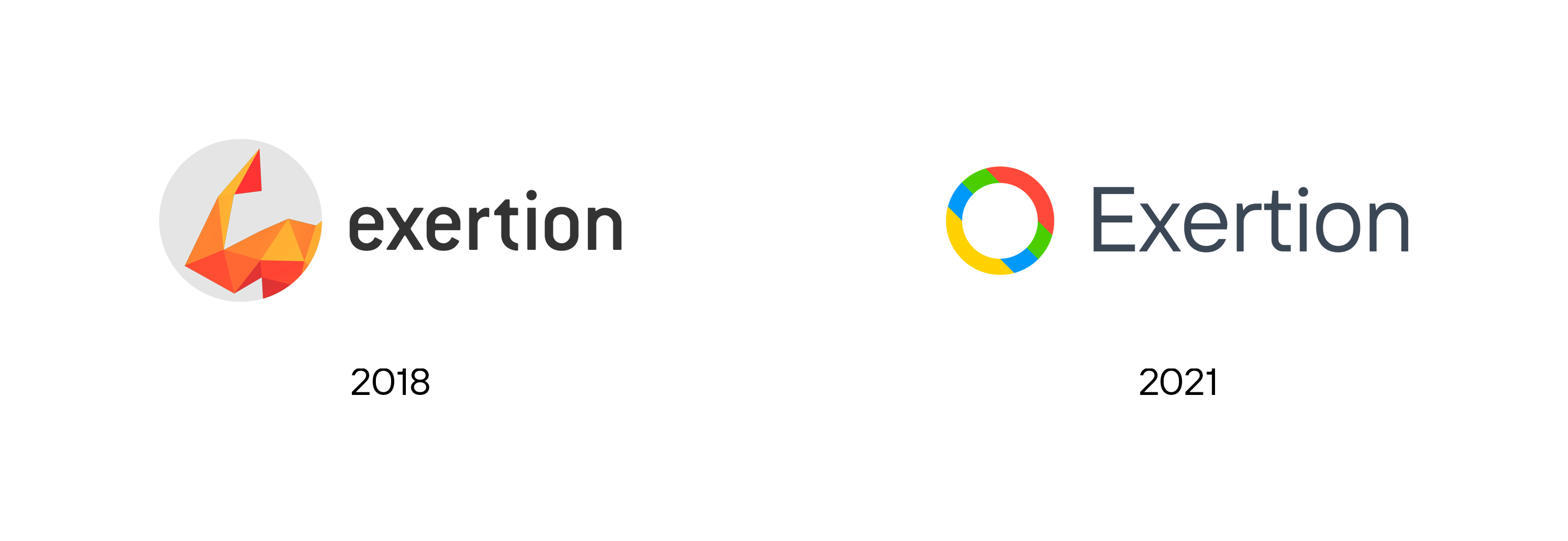
Our new corporate branding is designed to authentically reflect in what we truly believe and to reflect our enthusiasm we work to cultivate in our environment and ultimately around the world. Instead of adhering to a single colour tone for our brand (which we previously had with red and orange), for our new identity we wanted to embrace multiple colours to deliver multiple expressions.
Upon first impressions of our new identity, we aim to communicate that we embrace diversity whilst also presenting a level of positivity and joy, voicing our childlike, playful and fun attitudes.
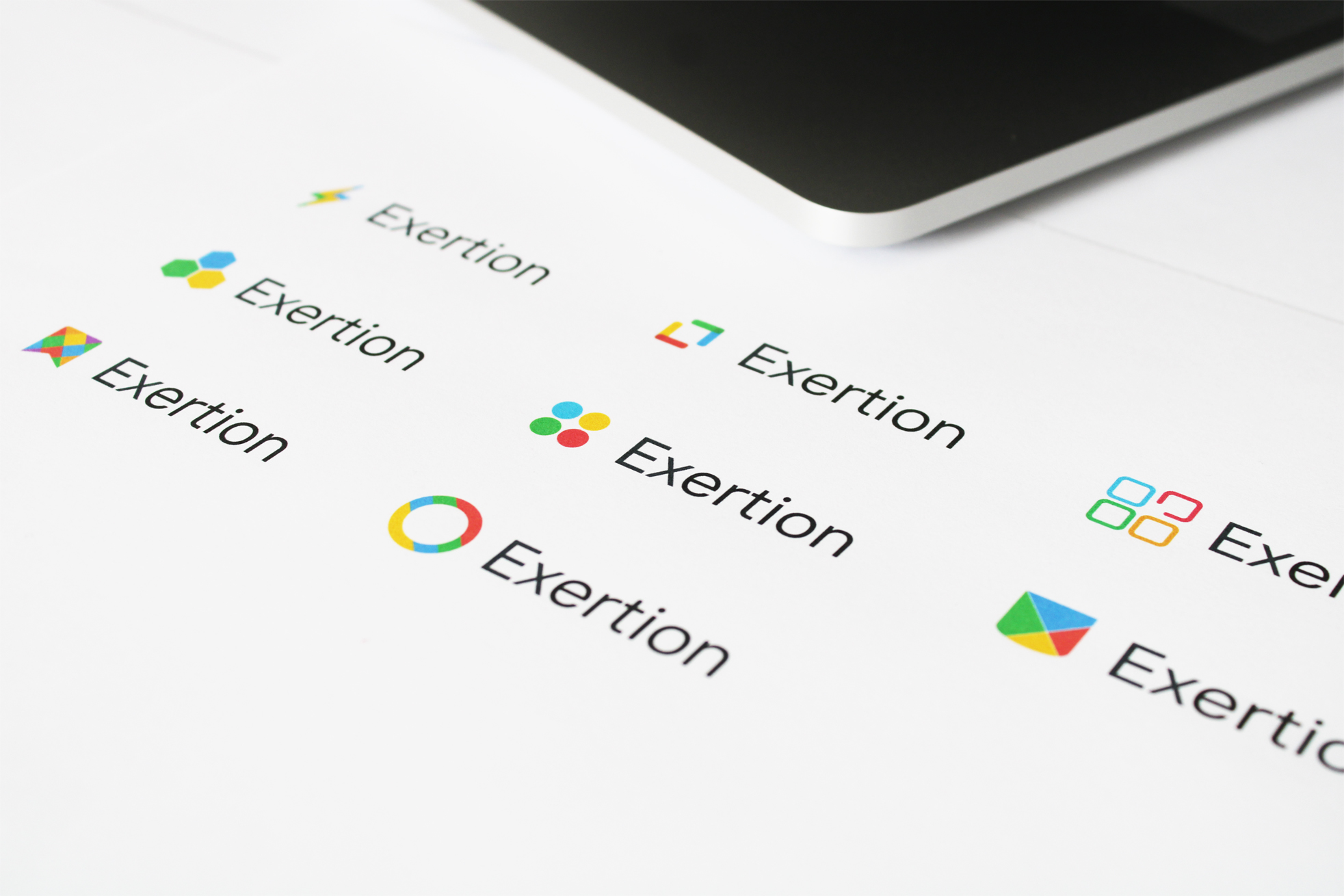
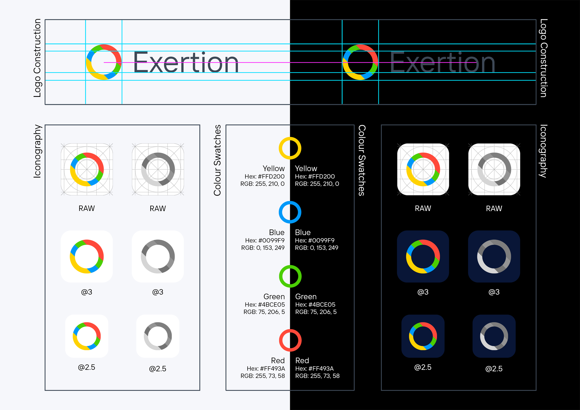
In order to achieve our final donut shaped icon which constructs our logo, we underwent rigorous experimentation with various colours, shapes and pattern textures before making the decision and commitment to stand behind our present-day logo.
Typeface
The typeface includes a facelift from our previous logo, now utilising the "TT Interphases" font, a sans-serif font designed with the digital age in consideration. The leading 'E' in 'Exertion' is now capitalised, removing any ambiguity of capitalisation when the company name is referred to in sentences, where the name is consistently cited in both text and logo. Collectively tied with our new colouring the brand boasts a clean aesthetic, removing any opinionated pronouncements and offering a more approachable aura.
In Digital Display and Physical Print
The new logo has been strategically designed to remain visible on both light and dark backgrounds without the need for colours to be changed or altered, which was a drawback for our previous logo especially with the rise of operating systems and applications introducing support for light and dark mode themes.
This was first noticed in company email messages, where certain mail clients presented the message contents on both a light and dark background depending on the time of day. By selecting colours in a calculative manner, we have been able to cater for both backgrounds with a single logo without the need for alterations.
Additionally as we continue to progress on with our software development, we're getting closer to the release of our first major application. In preparation for a physical release, our new branding can be printed on software packaging exhibiting a clean yet simple identity, better illustrating our company values.